Mastering Monitor Calibration: A Designer’s 2026 Guide to Perfect Color
Mastering Monitor Calibration: A Designer’s 2026 Guide to Perfect Color
In the vibrant and ever-evolving world of digital design, color is not just an aesthetic choice; it’s a critical component of communication, brand identity, and emotional resonance. For designers, photographers, videographers, and anyone involved in visual creation, the ability to perceive and reproduce accurate colors is paramount. Yet, a common and often overlooked hurdle is the inconsistency in how colors are displayed across different screens. This is where monitor color calibration becomes not just a recommendation, but an absolute necessity. As we move further into 2026, with increasingly sophisticated display technologies and higher client expectations, the importance of a properly calibrated monitor has never been greater.
Imagine spending hours meticulously perfecting a design, only to have a client view it on their screen and see entirely different colors. Or perhaps you’re a photographer, and the prints you receive don’t match the vibrant hues you saw on your editing display. These frustrating scenarios are direct consequences of uncalibrated monitors. Your monitor, fresh out of the box, is rarely set up for true color accuracy. Factory settings are often geared towards brightness and saturation that might appeal to the average consumer, but they fall short of the precision required for professional creative work. This comprehensive guide will walk you through everything you need to know about monitor color calibration in 2026, ensuring your digital canvas reflects your artistic vision with impeccable fidelity.
We’ll delve into the ‘why’ behind calibration, explore the essential tools and software, provide a step-by-step process, and discuss advanced techniques to maintain your color-accurate workflow. Whether you’re a seasoned professional or just starting your design journey, understanding and implementing effective monitor color calibration will elevate your work, reduce costly revisions, and build greater trust with your clients. Let’s embark on this journey to true color confidence.
The Indispensable Role of Monitor Color Calibration for Designers
Why is monitor color calibration such a critical aspect of a designer’s workflow? The answer lies in the very nature of digital color itself and the complexities of display technology. Every monitor, regardless of its brand or price point, has slight variations in how it interprets and displays color signals. These variations are influenced by factors such as panel technology (IPS, VA, OLED), backlight uniformity, age of the display, and even ambient room lighting. Without proper calibration, your monitor is essentially speaking a different color language than other devices, leading to a cascade of potential issues.
Ensuring Color Consistency Across Devices
One of the primary benefits of meticulous monitor color calibration is achieving color consistency. In a world where designs are viewed on smartphones, tablets, laptops, and various desktop monitors, ensuring your work looks the same across most of these platforms is a significant challenge. While perfect uniformity is an elusive dream due to the vast array of display technologies, calibration brings your monitor into a standardized color space, making its output predictable and closer to how it will appear on other calibrated or well-maintained displays. This consistency is vital for brand guidelines, client approvals, and the overall integrity of your creative output.
Accuracy for Print and Web
For designers working on projects destined for print, monitor color calibration is non-negotiable. The discrepancy between screen colors (RGB) and print colors (CMYK) is a well-known hurdle. However, a calibrated monitor helps bridge this gap significantly. By setting your display to a standard color profile (like sRGB for web or Adobe RGB for print-centric workflows), you gain a more accurate preview of how your colors will translate to paper. This minimizes costly reprints due to unexpected color shifts and streamlines the proofing process. Similarly, for web design, ensuring your colors render correctly across browsers and devices starts with an accurate source display.
Reducing Eye Strain and Improving Ergonomics
Beyond pure color accuracy, proper monitor color calibration contributes to a more comfortable and productive work environment. Uncalibrated monitors often have overly bright displays, incorrect white points, or color casts that can lead to eye strain, fatigue, and even headaches over long periods. Calibration optimizes brightness levels, sets a neutral white point, and ensures a balanced color temperature, making your screen easier on the eyes. This ergonomic benefit, while often overlooked, is crucial for designers who spend countless hours in front of their screens.
Professionalism and Client Trust
Ultimately, a commitment to monitor color calibration reflects a high level of professionalism. When clients receive work that consistently matches their expectations, or when a print job comes back perfectly aligned with the digital proof, it builds immense trust. It demonstrates that you understand the nuances of color management and are dedicated to delivering the highest quality output. In the competitive landscape of 2026, this attention to detail can be a significant differentiator.
Understanding the Fundamentals: Key Concepts in Monitor Color Calibration
Before diving into the practical steps of monitor color calibration, it’s essential to grasp a few fundamental concepts. These terms form the bedrock of color management and will help you make informed decisions throughout the calibration process.
Color Spaces (sRGB, Adobe RGB, Display P3)
- sRGB: This is the most common color space, widely used for web content, consumer electronics, and general-purpose viewing. Most non-professional monitors are designed to cover the sRGB gamut. If your primary work is for the web, sRGB is often your target.
- Adobe RGB: A larger color space than sRGB, Adobe RGB encompasses a wider range of greens and cyans, making it particularly beneficial for print photography and graphic design where a broader spectrum of colors is required. Professional photo and design monitors often support a high percentage of Adobe RGB.
- Display P3: Gaining prominence with Apple’s Retina displays and other high-end devices, Display P3 offers a gamut wider than sRGB but slightly smaller than Adobe RGB. It’s becoming increasingly important for video editing and content consumed on modern mobile devices and high-end displays.
Choosing the right target color space for your monitor color calibration depends on your workflow. For most general design and web work, sRGB is a safe and often correct choice. For print and photography, Adobe RGB or even wider gamuts might be necessary, provided your monitor can accurately display them.
White Point (Color Temperature)
The white point refers to the color of pure white on your display. It’s measured in Kelvin (K). Common white points for creative work include:
- D65 (6500K): This is the standard white point for sRGB and is commonly used for web content and general viewing. It represents daylight at noon.
- D50 (5000K): Often preferred for print-centric workflows, D50 is warmer than D65 and better matches the color temperature of standard print viewing environments (e.g., light booths).
An incorrect white point can make your images appear too warm (yellowish) or too cool (bluish), fundamentally altering your perception of colors during design. Accurate monitor color calibration will set this correctly.
Gamma
Gamma describes how tones from black to white are displayed on your monitor. It controls the brightness of mid-tones and influences the contrast and shadow detail. Common gamma values are:
- Gamma 2.2: This is the standard for both Windows and macOS (since OS X 10.6 Snow Leopard) and is the target for sRGB. It provides a good balance for most viewing environments.
- Gamma 1.8: Formerly the standard for older macOS versions, it’s now less common for general use but might still be relevant in very specific legacy workflows.
An incorrect gamma can make your images look washed out (too low gamma) or overly dark with crushed shadows (too high gamma). Achieving the correct gamma is a key aspect of effective monitor color calibration.
Luminance (Brightness)
Luminance refers to the overall brightness of your display, measured in candelas per square meter (cd/m²), also known as nits. An overly bright monitor can lead to eye strain and an inaccurate perception of contrast and shadow detail, especially when trying to match prints. Common target luminance values for designers are typically between 80 cd/m² and 120 cd/m², depending on ambient light conditions. Ambient light significantly impacts perceived brightness, so a darker room allows for lower luminance settings.
Essential Tools for Monitor Color Calibration in 2026
While some basic calibration can be attempted using your operating system’s built-in tools, achieving true professional-grade monitor color calibration requires specialized hardware and software. In 2026, the market offers several excellent solutions.
Hardware Calibrators (Colorimeters & Spectrophotometers)
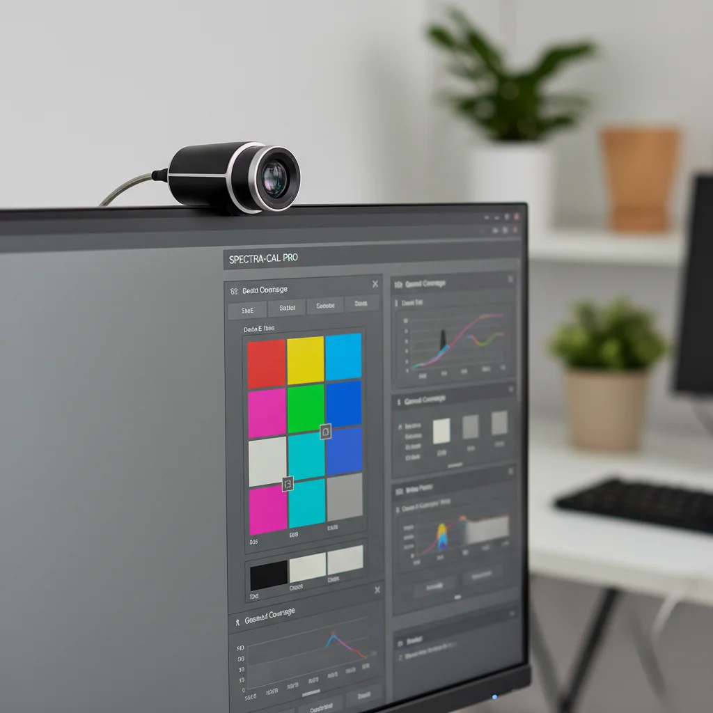
These are the cornerstone of accurate monitor color calibration. They are physical devices that attach to your screen and measure the colors and light output directly from the display.
-
Colorimeters: These are the most common and affordable type of calibrator. They use three color filters (red, green, blue) to measure light and are excellent for calibrating LCD and LED displays. Popular brands include X-Rite (now Calibrite) and Datacolor (Spyder series). They are generally very accurate for emissive displays.
-
Spectrophotometers: More expensive and typically used by color professionals, spectrophotometers offer a broader spectrum of measurement capabilities. They measure light across the entire visible spectrum, making them more versatile for profiling both emissive (monitors) and reflective (printers, paper) surfaces. They are less prone to drift over time and can often handle a wider range of display technologies, including those with unusual backlights. Many high-end colorimeters now incorporate spectrophotometer-like capabilities.
For most designers, a good quality colorimeter (like the Calibrite ColorChecker Display Pro or Datacolor SpyderX Elite) will provide excellent results for monitor color calibration. These devices come bundled with their own calibration software, which is crucial for the process.
Calibration Software
While the hardware measures the display, the software interprets those measurements and creates an ICC (International Color Consortium) profile. This profile is a small file that tells your operating system and color-managed applications exactly how your monitor behaves – its strengths, weaknesses, and unique color characteristics. When you perform monitor color calibration, the software guides you through the process, displaying various colors and tones for the hardware to read, and then generates this profile.
Most hardware calibrators come with their own proprietary software. While third-party options exist (like DisplayCAL), sticking with the manufacturer’s software is generally recommended for ease of use and compatibility, especially for beginners.
Step-by-Step Guide to Monitor Color Calibration (2026 Edition)
Performing monitor color calibration might seem daunting at first, but by following these steps, you’ll achieve accurate results. This guide assumes you are using a hardware calibrator with its accompanying software.
Step 1: Preparation is Key
-
Warm-Up Time: Turn on your monitor at least 30 minutes before calibration. Displays need time to stabilize their light output and color characteristics. For professional monitors, an hour is even better.
-
Clean Your Screen: Dust, smudges, and fingerprints can interfere with the calibrator’s readings. Use a microfiber cloth and a screen-safe cleaner to ensure your display is spotless.
-
Optimal Lighting Conditions: Calibrate your monitor in the lighting conditions you typically work in. Ideally, this should be a consistent, neutral light source, avoiding direct sunlight or strong colored lights. Dim, consistent ambient light is often preferred to prevent the room’s lighting from influencing your perception of the screen.
-
Reset Monitor Settings: Before you begin, reset your monitor to its factory default settings. Disable any dynamic contrast, vivid color modes, or other image enhancements. If your monitor has a hardware calibration option or a dedicated ‘Custom’ or ‘User’ mode, select that.
-
Install Software & Drivers: Ensure your calibrator’s software and any necessary drivers are installed and up to date.
Step 2: Launch the Calibration Software
Open your calibrator’s software (e.g., Calibrite Profiler, Datacolor SpyderX Elite software). The software will guide you through the process. You’ll typically be asked to choose your display type (LCD, LED, OLED) and the type of calibration you want to perform (e.g., ‘Calibrate and Profile’).
Step 3: Define Your Calibration Targets
This is where you’ll apply the concepts we discussed earlier. The software will prompt you to set your target values for monitor color calibration:
-
White Point: For most web and general design work, D65 (6500K) is appropriate. For print, D50 (5000K) is often recommended.
-
Gamma: Set this to Gamma 2.2 for most Windows and macOS users. This is the standard for sRGB.
-
Luminance: Start with a target of 100-120 cd/m². You might adjust this slightly based on your ambient lighting and personal preference, but avoid going too high. If your room is very dark, you might go as low as 80 cd/m².
-
Color Space/Gamut: If your monitor supports it and your workflow requires it, you might select Adobe RGB or Display P3. Otherwise, the software will typically aim for the native gamut of your display and create a profile that describes it accurately within your chosen White Point, Gamma, and Luminance settings.
Step 4: Connect and Position the Calibrator
Plug your calibrator into a USB port. The software will instruct you to hang the device over your screen, ensuring it sits flush against the display surface. Most calibrators have a counterweight to keep them in place. Make sure no ambient light is hitting the sensor directly.
Step 5: Run the Measurement Process
Once the calibrator is in position, the software will begin displaying a series of color patches and gray tones. The calibrator will read these colors, sending the data back to the software. This process usually takes several minutes. It’s crucial not to disturb the calibrator or interact with your computer during this phase of monitor color calibration.
Step 6: Adjust Monitor Hardware (If Prompted)
Some calibration software will first attempt to adjust your monitor’s brightness, contrast, and RGB gains via the monitor’s on-screen display (OSD) menus. Follow the software’s instructions. This ‘hardware calibration’ step is ideal as it makes adjustments at the display level, preserving more color information. Many modern professional monitors offer extensive OSD controls that facilitate this.
Step 7: Create and Save the ICC Profile
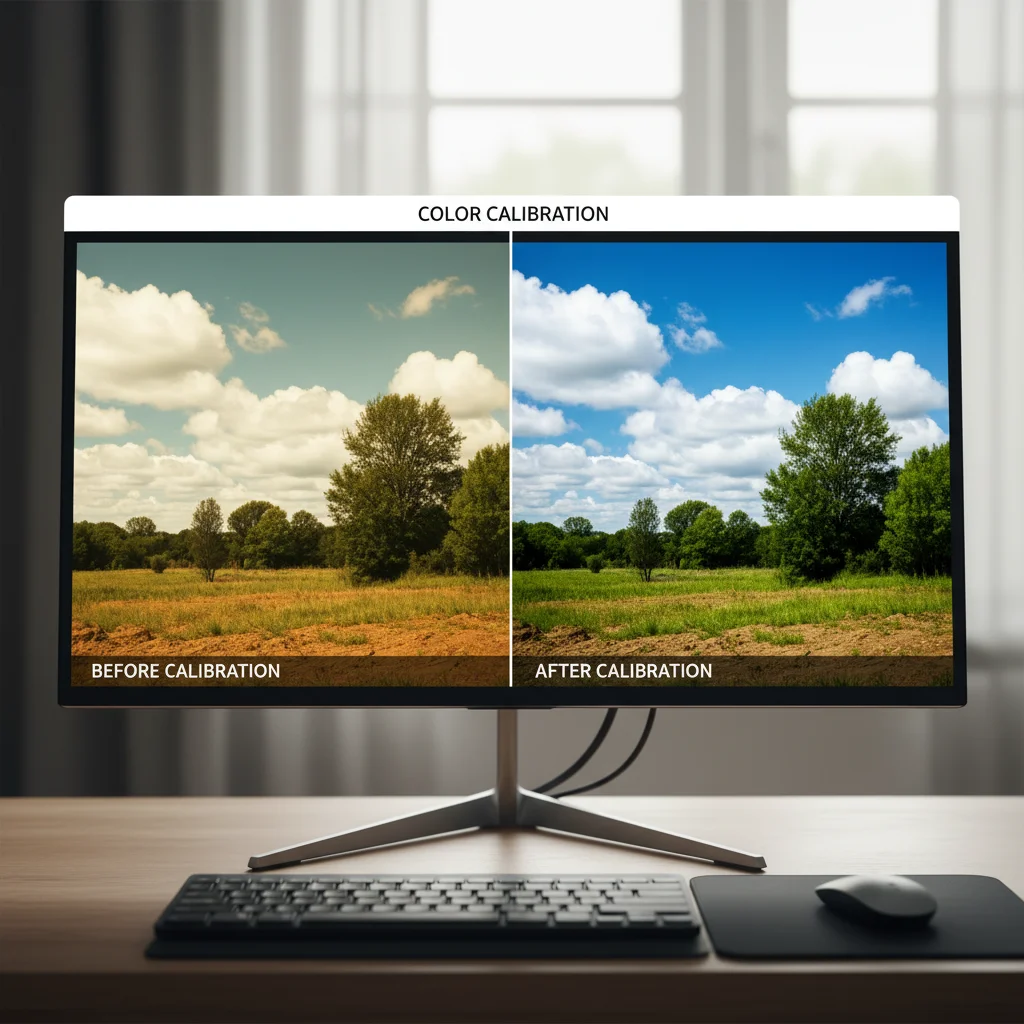
After all measurements are complete, the software will generate an ICC profile. You’ll be prompted to name and save this profile. The software usually sets it as the default profile for your display. This profile tells your operating system how to correctly interpret color data for your specific monitor. Most software will also give you a ‘before and after’ preview, allowing you to see the impact of your monitor color calibration.
Maintaining Color Accuracy: Beyond the Initial Calibration
Monitor color calibration isn’t a one-and-done process. Displays drift over time due to factors like backlight aging and temperature changes. To ensure ongoing color accuracy, regular recalibration is essential.
Recalibration Schedule
For professional designers, recalibrating your monitor every 2-4 weeks is a good practice. If your work is extremely color-critical, or if you notice any visible shifts, recalibrate more frequently. The software will typically remind you when it’s time for a new calibration.
Environmental Consistency
Try to maintain consistent ambient lighting in your workspace. Significant changes in lighting can affect your perception of the calibrated display. If you frequently change your working environment, consider recalibrating or at least visually checking your display in the new setting.
Monitor Quality Matters
While calibration can significantly improve any monitor’s accuracy, a higher-quality display will always yield better results. Professional-grade monitors (often IPS panels with wide gamut support) offer better color uniformity, stability, and a wider range of adjustability, making them easier to calibrate and maintain accuracy. Investing in a good monitor is an investment in your color confidence.
Software Color Management
Once your monitor is calibrated, ensure that your design software (e.g., Adobe Photoshop, Illustrator, Lightroom, DaVinci Resolve) is also set up for proper color management. This means working in appropriate color spaces (e.g., sRGB, Adobe RGB) and ensuring that your applications are using your newly created ICC monitor profile. Most professional applications automatically detect and use the system’s default monitor profile, but it’s always good to double-check their color settings.
Troubleshooting Common Monitor Color Calibration Issues
Even with the best tools and intentions, you might encounter some issues during or after monitor color calibration. Here are a few common problems and their solutions:
Colors Still Look Off After Calibration
-
Check Your Software Settings: Ensure your design applications are color-managed and correctly using your monitor’s ICC profile. Some web browsers might also need specific settings for color management (though most modern browsers are color-aware by default).
-
Verify Ambient Light: Strong, colored, or inconsistent ambient light can trick your eyes into perceiving inaccurate colors, even on a perfectly calibrated screen. Try to work in a controlled lighting environment.
-
Monitor Limitations: Some monitors, especially older or budget models, simply cannot achieve perfect color accuracy or uniformity across the entire screen. Calibration will improve them, but it can’t overcome fundamental hardware limitations.
-
Recalibrate: If it’s been a while, or if you’ve changed any monitor settings, perform another monitor color calibration.
Calibration Fails or Gives Errors
-
Hardware Connection: Ensure your calibrator is securely plugged into a working USB port. Try a different port if necessary.
-
Software Conflicts: Close any other color-related software or utilities that might interfere with the calibration process. Disable any built-in monitor calibration software if your OS has one (e.g., Windows Color Management’s basic calibration).
-
Drivers & Updates: Make sure your calibrator’s software and drivers are fully updated. Check the manufacturer’s website.
-
Reset Monitor: Go back to factory default settings on your monitor’s OSD before restarting the calibration.
Inconsistent Results Between Monitors
If you’re working with a multi-monitor setup, it’s crucial to calibrate each monitor individually. Even identical models can have slight variations. Aim for similar calibration targets (white point, gamma, luminance) across all displays to achieve the best possible match.
The Future of Monitor Color Calibration in 2026 and Beyond
As display technology continues to advance, so too will the methods and tools for monitor color calibration. In 2026, we are seeing a trend towards:
-
Integrated Calibration: More high-end professional monitors are coming with built-in calibration sensors or direct hardware calibration capabilities, simplifying the process and potentially offering greater accuracy by bypassing the operating system’s graphics card lookup tables (LUTs).
-
AI-Assisted Calibration: Future calibration solutions might leverage AI to learn from environmental factors, user preferences, and even content types to provide more dynamic and adaptive color profiles.
-
Wider Gamuts and HDR: As displays increasingly support wider color gamuts (like Rec.2020) and High Dynamic Range (HDR) content, calibration tools will need to evolve to accurately profile and manage these advanced capabilities. This is already a significant area of development.
-
Cloud-Based Profiles: The possibility of cloud-synced calibration profiles could allow designers to maintain consistent color across multiple devices and locations more easily.
Regardless of these advancements, the core principles of monitor color calibration—measuring, profiling, and maintaining—will remain essential. The goal is always to ensure that what you see on your screen is a true representation of your creative intent.
Conclusion: Embrace Color Confidence with Calibration
For designers in 2026, mastering monitor color calibration is no longer an optional luxury; it’s a fundamental skill and an indispensable part of a professional workflow. It’s the bridge between your creative vision and its accurate realization, whether on screen or in print. By investing in a hardware calibrator, understanding the core concepts of color management, and following a consistent calibration schedule, you empower yourself with unparalleled color confidence.
Eliminate the frustration of color discrepancies, enhance your productivity, reduce revisions, and build stronger client relationships based on trust and consistent quality. Take the step today to calibrate your monitor, and unlock the true potential of your creative work. Your eyes, your clients, and your designs will thank you for it.